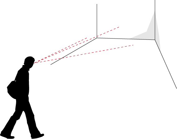
A person arriving in a certain place will benefit from a series of signals alerting about the characteristics of that space.
The person could hear some sounds, or see some objects or furniture laid out according to a certain scheme. Or a video of some sort could be present, or some lights, using specific colors, rhythms, imagery.
The place will have a certain style, including some specific images which decorate walls, furniture, or the graphics which are disseminated in various parts of space.
Things will have specific shapes and materials.
All these – the sensorial stimulation which a place of any type communicates to a person – combine in alerting the person about the things that he/she will perceive as being possible in that space.
The place, through its sounds, visible objects, shapes and layouts, through the images, colors and forms, communicates (or, at least, tries to communicate) about what is its purpose, what is possible or impossible to do with/in it, and, most important of all, what is suggestes that the person (user) should do with/in it.
This concept is defined as affordance.
Affordance is a very useful term in design: it indicates the attitude which a certain “object” (or place, or service, or environment…) has to communicate information about its purpose and about the ways in which it can/should be used.
This wonderful article by Donald Norman shows an interesting take on the concept of Affordance.
In Norman’s analysis of affordances is the idea that, while designing, it is of uttermost importance to focus on the perceived affordance, which is a relationship running between the user and the object/place/system, according to which the user perceives that a certain task is possibly executable using that object/place/system.
Some affordances originate from the physics of the object/place/system (e.g.: a screen has a limited surface and the mouse pointer cannot be moved outside of it).
Some other affordances have cultural value: they are learned behaviors. We know that some things work in a certain way, according to a certain logic, because we have learned about it. Interface elements work according to arbitrarily defined logics, yet we have learned a few of these logics which have become really well-known and successful, so that now we know how scroll-bars, buttons, checkboxes and other elements work. There was no reason for them to be designed in this way, they could have been created in completely different ones. Yet we learned to recognize them and their functionalities in a certain way, and so this is the way in which we expect them to work.
The fact that affordances often originate from culture produces an interesting (side) effect: the fact that if we take some object, for example, whose usage strategy is already well-known and defined, and we design it in ways which are divergent from this strategy, users will be disoriented. They will expect the “thing” to work in a certain way, to be grabbed, touched, walked-through, in that way which they have learned from their personal and cultural experience. If it works differently they will have a shock (small or big that it is), and they will not know what to do (initially, at least).
This is a thing to be kept in mind while designing. And it is also a nice rule to break once in a while, to achieve some specific effect.
Affordance can be measured, in more than one way.
For example tests are often organized to measure the affordance of objects and spaces by letting people using them without providing any information about their intended use.
Expert Usability review is one of them, and requires than one (or, preferably, more than one) experts perform a complete review on the affordances of the objects/environments/systems that you design, providing feedback and suggestions.
Usability tests require “real users”. There are multiple ways in which you can do usability tests (for examples look HERE, HERE and HERE), and each one of them requires that a group of users actually use the object/environment/system.
This task can be performed in a variety of ways: for example users could be given a certain task to be executed, and we would measure the time, difficulties and strategies used by them, to infer possible optimizations and modifications of our design; or we could choose to avoid giving any form of hint about what to do and just place them in front of the object and tell them “use it!”, and observe their actions, to infer if the intended usage of the thing has been made clear and understandable.
This kind of test is done all the time and it doesn’t even require that the users are aware that they are being used as test subjects: multiple technologies, such as motion tracking, eye tracking, sensors and other electronics and software are commonly used by stores, for example, to observe how people move and operate through their spaces, to understand if the layout of aisles, products and signage effectively promote their commercial strategies.
Designing environments with embedded technologies
As said in the beginning environments alert us about their affordances in a variety of ways, using sounds, visions and other sensorial stimuli which are perceivable by the user.
Actually, in more than one way, the experience of an environment/event begins before the person arrives at the “Place”, because the individual might have some pre-existing expectations about the place they are going to: they might have read about it on the web, seen it on television, discussed it with friends, received a brochure, or just passed in front of it multiple times without entering.
These are all tasks which need to be engaged while designing an environment (or an object, or an event): the design cannot simply live on the physical level (describing form), but has to confront with information and communication.
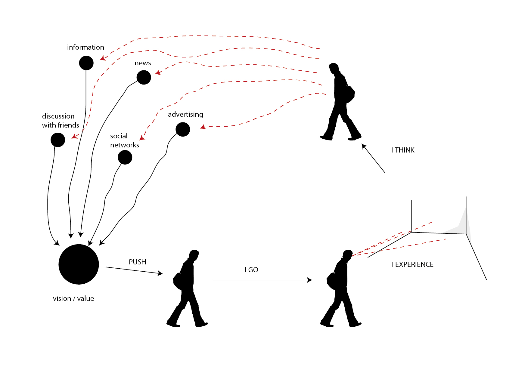
So we can imagine to expand the initial diagram of this article to include a set of additional phases.
Users, thus, form a vision and a perception of value about the thing which we are designing (in our case, we will deal with an environment or event, but the same rules apply to other types of design, as well), even before they experience it.
This is a very powerful tool to keep in mind, as we can substantially prepare people for our experience, to make it enjoyable, useful, worthwhile.
This action is a cultural and symbolic action. What is performed is to publicize (publish) symbols and cultural references (the “culture of the event”) so that they are perceivable and understandable, and also to create those infrastructures which allow these symbols and references to become alive, allowing people to actually perceive them, understand them, relate to them, communicate them, discuss them and, in this process, transform, personalize and appropriate them.
Note: This is a very delicate and strategic set of tasks, and it often defines the success or failure of initiatives. Specific effort will be given to this process in the following lessons.
Information, news, advertising, social network activity, community building and visual presence in strategic spots are some of the tools which we can use to perform this task.
With this process we create the cultural/symbolic vision/value of the event.
This is, in most cases, the drive that pushes individuals and groups to actually go to the environment/event to experience it, arriving at the situation described by the previous version of the diagram.
The cycle is not complete, yet.
When people “complete” the experience they will not be in a vacuum, but they will continue their lives and relations.
We can/should imagine our design in something that transforms the post experience, as well.
To do this, we can imagine to design forms of interaction which go beyond the localized experience of the event, and are dedicated to allow people to interact with the event space from other locations, to reach out from the location onto other places and networks and, most important of all, to express ideas, perceptions and visions about the event in lively, shareable ways, generating discussion and, thus, further communication.
Tho achieve the objectives we set forth (interconnect physical and digital spaces to create an ecosystem which allows people to live an experience before, during and after the event, in ubiquitous ways) we can take into account the ways in which we can enact this process.
As described in the beginning of the lesson, space offers a series of perceived affordances which describe the relationship which is established between the person and the environment, informing the former about the possible actions, tasks and opportunities for interaction offered by space itself. We also saw how the understanding of such affordances are partly due to the physical evidence provided by the environment, and part to the cultural background of the person.
Our experience of places is progressively more defined through dimensions which are not only physical, but also digital.
Music coming from our headphones allows us to personalize spaces and to transform them. A phone call received on our mobile phone can transform a park bench into a temporary ubiquitous office.
We can design spaces to become infrastructures in which multiple types of interaction and communication take place at the same time.
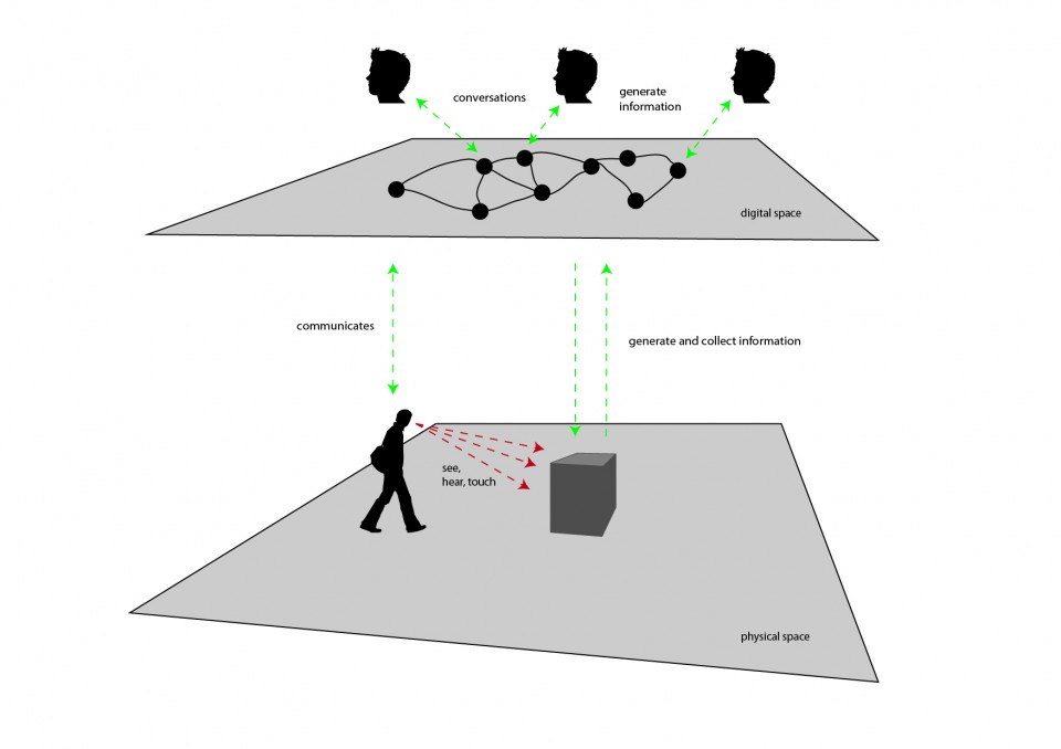
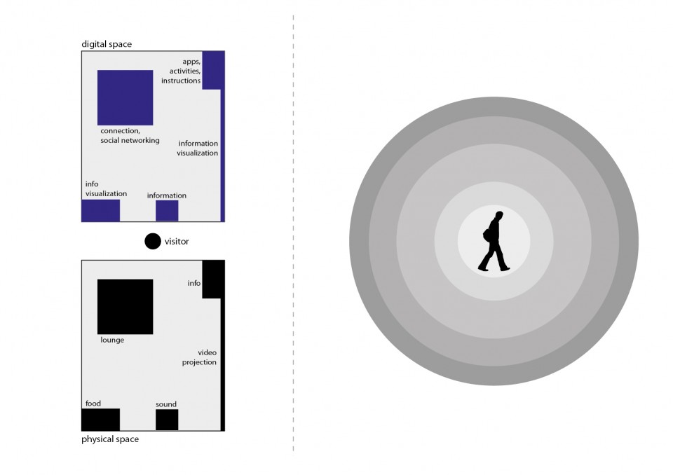
In the diagram above, a man traverses a certain physical location and encounters an opportunity for interaction (the dark gray box at the center).
The man can use his senses to interrelate to the experience: he can see images, hear sounds, and touch it.
Using ubiquitous technologies we can imagine to create peculiar interactive experiences which form bridges among different worlds.
For example, this project [LINK] created multiple experiences which interconnected architectural spaces to the conversations held online by internet users, to create tools for awareness and understanding to be used by citizens and administrators to generate novel forms of citizenship.
The whole idea about this possibility is that we can give material representation and access (even in real-time) to information which is generated digitally by a multiplicity of subjects and systems.
In the drawing, the interactive experience could be, for example, able to collect information on themes which are relevant to the event, and provide aesthetic representations for it, possibly allowing visitors to interact with this information.
This is an exciting opportunity.
For visitors, it represents the opportunity to access a breath-taking experience, connecting them to (possibly) the whole planet. The possibility to see in real-time what people all over the world are saying about a certain, important, topic, is an enlightening experience, widening the perspectives according to which human beings experience the world and confront with it.
For organizers, it is the possibility to create a living connection between the space of the event and the rest of the world.
This possibility can be considered along multiple strategies: information visualizations showing how people on social networks confront with the themes which are relevant to the event; definite tasks which users online can express themselves, so that their opinion is shown in some form in the event space; opportunities for online users to interact with the activities which take place during the event, such as placing questions during conferences.
In the other direction: allow visitors to generate content from the event space, and make this content visible online so that opportunities will be generated for online users to interact with it; enact tasks for visitors to perform while at the event, and publish the results online, so that online users can access and interact with them; allow visitors to express themselves and to publish those expressions online; allow visitors to personalize their experience of event, generating lists, ratings, evaluations, and make them accessible for online users to experience.
In the physical space, specific evidence should be provided about the opportunities for digital interaction, enhancing their affordances and usability.
This should also be performed in digital space, making clear how/why interactions are available with the event.
In both cases, a form of rewarding system should be designed and communicated so that people will be more easily engaged. Badging systems, discounts, personalized experiences, dedicated happenings, content or information and possibility to interact with key players of the event are some of the possibilities.
In digital space, conversations will take place.
It is truly fundamental to be able to observe and use these conversations to enhance the experience of the event. They represent an important tool in understanding the scope, reach and effectiveness of the event.
Multiple ways are available to achieve this objective: the effective suggestion of hash-tags to be used while communicating online on themes regarding the initiative; the availability of accessible, usable, dedicated communication tools which people can use to communicate about/around the event; the setup of complete monitoring solutions for web and social networks, allowing for real-time analysis of the discussions which take place online.
These conversations should not only be captured and analyzed, but also made available and accessible to the people who engage the event, to both give them a glimpse of the realtime life of the event and to allow and suggest them to interact with this information and with the users who generate it.
On top of all this, specific tools (both cognitive, perceptive and practical) should be provided to visitors to make it for them as easy as possible to interact digitally, generating observable information and conversations.
Special care should be put on the theme of accessibility, enabling this kind of interaction for all kinds of visitors, from the more tech-savvy to the ones who have smaller degrees of technological literacy.
Digital interactions should come in multiple forms, from smartphone-based applications to activities involving pen-and-paper, or games or natural interactions involving handling objects, performing simple tasks, taking pictures or other easily and widely accessible activities.
In the design process, it is important to imagine and visualize the whole interactive ecosystem, as a tool which seamlessly fits in the full design process (such as sketches and prototypes).
One possible approach is to create an interaction ecosystem diagram.
The objective of this diagram is to visually describe the opportunities for interaction which are available to a certain individual or group in a specific space (physical, digital or hybrid).
Let’s examine the simple scenario in the image above.
On the left is a simple, schematic representation of a space, maybe the layout of a stand in a certain event. This part of the diagram is divided in two: on the bottom, is the description of space in terms of its physical components; on top is its description in terms of the opportunities for digital interactions it offers.
In this part of the diagram, thus, we see described a layout of the space. In the example we find:
- a reception in which visitors can go to obtain information and also the “instructions” on what can be done in the stand, under the form of brochures, signage and other items, as well as the availability of digital assets such as mobile applications which enhance the experience of the event;
- also found at the reception is the description of the activities which will take place at the stand, under one of possible forms such as calendars, signs and to-do lists;
- a lounge space offers people some space to relax as well as to connect to the network, to check their email, participate to social networking activities and games, and to participate to the overall digital conversation of the event by participating to one of the activities designed for the initiative;
- a large video projection provides a real-time information visualization; here visitors can see event-relevant information as it unfolds in real-time during the initiative, as well as verify the effect of their own interactions, which might pop-up on the projection together with the ones of the other visitors;
- a sound system provides music and effects to create atmosphere, but also can be used to diffuse information and alerts;
- a food stand provides the possibility to purchase something to eat and maybe provides some other visual perspective on the information which is relevant to the event.
On the right side of the diagram is the interaction ecosystem.
It is initially empty. Its purpose is to be filled with a network-shaped diagram describing the opportunities for interaction which are available to the user, as well as the actions that take the user from one part of the experience to the other, and the motivations moving the visitor from one part to the other.
Each node of the network diagram will represent an interaction. Each arch/edge of the network will represent an action/motivation which takes from one interaction to the other.
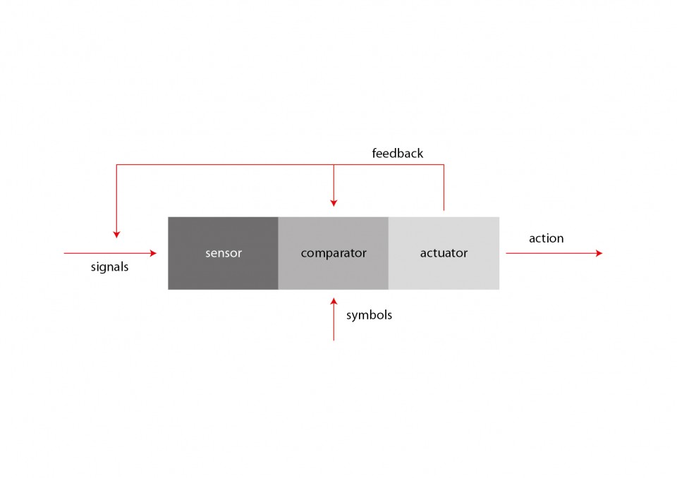
In drawing the diagram, it is important to remember how each interaction can be described in this form:
This scheme highlights how an interaction can be interpreted as a series of subsequent stages:
- a sensor, listens to selected signals coming from the environment; according to the perspective from which you observe the interaction, a sensor can take the form of the senses of a human being, or an electronic sensor used to catch information about the environment, or any other form according to which a certain signal (a sound, a weight, a touch, an image, a temperature, a taste…) is sensed by the system (e.g.: the human being, the interactive device…)
- a comparator compares incoming signals to a dictionary of relevant signals; if a match is found, the interaction is activated; not all signals are relavant to the objectives of the interaction; this is very clear if we look at it from the perspective of the human being: if i am looking to interact with some system providing news i will filter out the signage pointing me to the bathrooms, while i will be most interested in a sign which says “information available here”; the latter one will, thus, be part of the dictionary of symbols which is available to my comparator to activate my interaction in search for information;
- an actuator activates the system, enacting the interaction; continuing from the example above, when my comparator confirms that i have identified a sign pointing me to information, an actuator (my legs, for example) will allow me to embrace the interaction: moving towards the place indicated by the sign;
- once arrived at the point indicated by the sign, the process will start again with another interaction, involving other sensors, comparators and actuators dedicated (in the example) to handling our interaction with a mouse or touch screen, searching for signals which can be compared with my dictionary of symbols for interaction with information elements (icons, labels, buttons, animations, texts and other elements which are involved with the activity of dealing with on-screen information), and activating my actuators (hands, eyes, fingers…) to proceed to the next steps;
- this process can be analysed at infinite levels of detail; it is up to the designer to understand which groups of subsequent interactions can be grouped into larger-granularity clusters and in which cases it is better to dig in at full detail/granularity; for example, it could turn out that, if our focus is to design an environment, it could be needlessly resource-consuming to analyze the process of interacting with the touch screen in the example above at full detail, maybe limiting ourselves in identifying input/output characteristics of this interaction (in the example: query/answer, the user needs a certain information and obtains an answer, which becomes the “signal” for the next step of interaction)
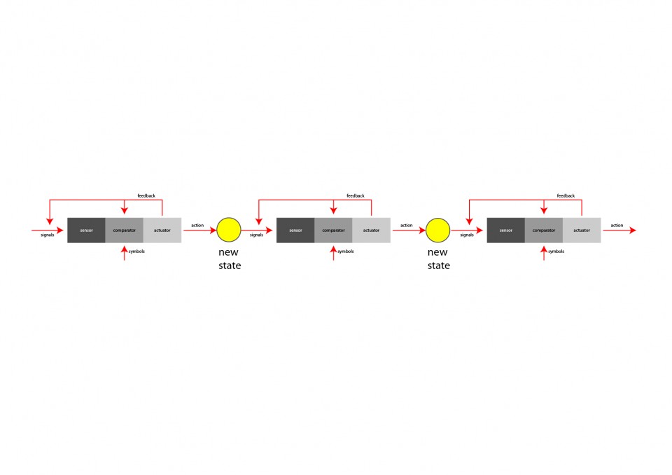
As shown in the diagram above, subsequent interactions are, thus, combined to form more complex interactions. Each interaction brings to a new state, which is a way to describe the scenario. In the example described in the previous paragraphs, each state could represent, for example, the position and attitude of the individual: first at the entrance of the event, looking for information; then in front of the touchscreen, navigating the interface; then moves to another part of the event (the place he was looking for, thanks to the information provided by the touchscreen interface), engaging some activity.
Each interaction generates feedback. Feedback comes in many forms and purposes: it can be created through sounds, images, mechanics or human relation. The objective of feedback is to provide evidence about the result of the action/interaction. A harsh sound might signal that a certain action did not produce its intended result; a bright image displaying an “OK! Success!” sign might indicate that the expected result was obtained.
Feedback (e.g.: any image, sound or other perceivable element created with an understandable cause/effect relationship by our action) informs the sensor and comparator stages of systems about the result of the action. Sensors and comparators can (and, usually, do) capture feedback as a signal, and use it to transform the behavior of the system. For example, if enough evidence is perceivable, an “alert! no success!” signal could be captured by the comparator stage of an interaction to eliminate the signal which originated the action, as unfitting to obtain the desired result.
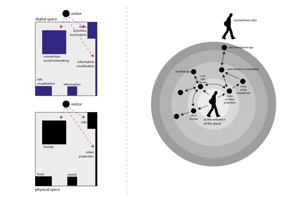
In describing our environment the creation of the right side of the interaction ecosystem diagram allows us to combine several interaction chains together to obtain specific results.
In the diagram above we filled in its previous, empty, version with a series of first steps.
The logic according to which this diagram is produced is to highlight the states – and the transitions from one state to the other – which human users go through while experiencing the series of interactions.
This diagram shows all the interactions at once, with the sequencing of their taking place described by the possibility to traverse the graph structure from one node to the other, by going through edges and arrows. (Sequencing is represented by network traversal).
In the example above we highlighted some of the things which might happen when our visitor finds him/herself at the “entrance” of our stand.
Note: these diagrams can become quite large quite quickly; prepare yourself with a large document if you wish to work on it digitally, or with large sheets of paper (or with the possibility to combine more than one sheet of paper). It is always advisable to work first on paper or to use one of the sketching tools which are now starting to be available, if you feel comfortable using them. A paper sketch is always the best bet to start off with the right foot. [LINK]
The diagram above is far from being complete, but it will help us to understand how the first steps are produced, and how it is possible to bring it to completion.
First of all: completion?
A diagram like this is never, literally, “complete”.
It is up to de designer to figure out up to which level of detail it should be completed.
The first times you will crate such diagrams, you will find yourself either writing down very generic things (e.g.: “the user uses the touchscreen”) or really-really detailed ones (e.g.: ” after moving his finger, user presses onto the screen; if the tip of the finger covers, at least partially, the area of the graphical representation of the button, an animation will start with about a 0.3s delay”).
There is no right/wrong way to do these diagrams. It is important that these diagrams serve you in helping out to formalize and systematize the design process. So you will be, each time, in charge of deciding which level of detail is the most useful one.
The first times you do it, you will make mistakes; but soon enough you will find out where the useful details are, and where a good, solid, generic statement will do the perfect job (e.g.: “the user pays using the POS” :) ).
So let’s analyze some of the elements found in the diagram above:
- states. States represent a “condition”. “The person is at the entrance of the stand”. “The person is in front of the video projection”. “The person is sitting in the lounge area, with his/her laptop connected to the wireless network”. All these are possible states. States are drawn on the diagram through human silhouettes (when the state concerns a human being), a box (when they represent the state of something which is not human), or by dots (when they are composite states, or when determining if the state concerns a human, a not-human or a group of different things is not that important; and it also saves space on the diagram);
- color codes can be used to make the diagram more readable (for example you might want to highlight suggested paths in different colors);
- fan-in/fan-out. They are, respectively, the number of arrows entering a certain state (black dot), and the number of arrows departing from a certain state. A fan-out that is too high could be a signal that the user could be disoriented by that environment (too many stimulations and possibilities), thus suggesting that countermeasures should be taken so that a smaller number of opportunities be available at once. A fan-in that is too low (eventually zero) could point out that there are too few ways (eventually none) in which the user can arrive to experiencing that part of the overall experience, suggesting that specific actions are made to signal that possibility (augmenting accessibility and usability through signals, sounds, lights…).
- states, transitions, states. The graph is created by assembling the available activities/interactions which can be engaged by the person in a certain state. Referring to the diagram above, a possible approach to determine “what is possible in a certain state” could require understanding what the user sees/hears in a certain spatial position. For example, in the entrance of the stand the user sees the lounge space, the reception booth and the large video projection, indicating that he/she could move to go/engage either of them, thus determining the three arrows going outward from the initial state. Each action (arrow) ends in a new state (or, eventually, in a previous state, if this has already been defined, and the action “takes you back to it”).
- transitions. Transitions represent the interaction. So you could imagine to replace the transitions (arrows) with the interaction diagrams (sensor/comparator/actuator) previously examined in the lesson. In each state the subject experiences a set of signals, some of which are captured by his/her/its sensors, compared to the symbols in the dictionary of the comparator and, if positively sensed, stimulate an action, which brings to a new state. The diagram of the interaction becomes an arrow describing a transition from one state to the other. It is common practice to identify each transition/interaction with a unique number, and to provide the single interaction diagrams in separate sheets, labelled with that same identifying number.
- loops. Loops can exist in the diagram, and describe things which can be iterated. For example the diagram above shows how the person can interact multiple times with the video projection.
- external entities. In the diagram it is possible to include the presence of external entities (other visitors; people interacting through networked systems; automatic systems…). This, for example, can show how different people can communicate (directly, through networks or other technologies or techniques…) and collaborate/interrelate to each other, or (in the case of “systems”) how some systems (which can be human – such as “the staff” – or not human – such as “the alarm system” – ) take part in the interactions and communications.
- conditions. Some transitions may be subject to conditions. In the example we might wish to highlight that if the used did not yet install a smartphone application, no voting using it would be possible. Conditions are expressed by placing a small empty circle by the transition arrow (usually nearby where the transition starts, to show that the transition cannot be started if the condition is not verified) with a label inside it (usually formed by a “c” letter, followed by a unique number that identifies each condition), and then by formally describing each transition on a separate sheet of paper, using a few, very precise, sentences labelled with the same label found inside the little circle.
A good exercise to perform to get used in making these diagrams, is to try and make them for common experiences (such as “my living room”, or “my kitchen”).
Possible suggested steps are:
- start with a definite scenario (“person sitting on the sofa”)
- list all significative stimuli perceived while being in the scenario (“I see the television set”, “i hear noise coming from the kitchen”, “i see a pile of unread magazines on the table”, “i see a new email popping up in the monitor of the computer near-by”)
- for each of these stimuli, draw an arrow, label it with a unique number (1, 2, 3 … ) and draw the relative interaction diagram on a separate sheet of paper,
- define the end state for each interaction; draw and label each of them at the end of the transition/interaction arrows;
- for each new state repeat steps 1-4
Review your choices often: you will find out that you’ve gone too deep in detail in some areas and in too little detail in other ones; or that you described a certain sequence of interactions in ways which just don’t seem natural.
Get ready to re-draw often: start on paper and don’t take too much time in drawing each one of the first sketches (you will make several tries before you start going in the right direction): you don’t want to waste hours of precious time on your first drawings, as you’ll be probably throwing them away. Start by rapidly sketching the first versions of the diagram (don’t take more than a few minutes for each of the first ones) and throw them away as soon as something doesn’t feel right, and start over, maybe just keeping for reference some of them which show some things that seem right. As soon as you get going into a convincing direction, you can start drawing things better and to bring things into a drawing program and start taking time to do things nicely. These diagrams also turn out to be beautiful representations of the environment which you are designing and, so, use your imagination and make them beautiful, if you can/have time, as they will be really useful in communicating the concept of your design.
![[ AOS ] Art is Open Source](https://www.artisopensource.net/network/artisopensource/wp-content/uploads/2020/03/AOSLogo-01.png)
